

News 最新消息

全台第31間睿聲助聽器門市【三重門市】3月28日起正式為新北三重的鄉親們服務囉!快來門市打卡就送精美小禮物!
全台第30間睿聲助聽器門市【北斗門市】2月20日起正式為彰化的鄉親們服務囉!快來門市打卡就送精美小禮物!
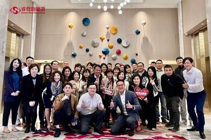
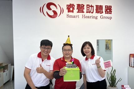
2023年睿聲助聽器加盟商年度展望會圓滿成功!

最新助聽器補助流程、助聽器補助金額與相關規定於112年1月1日生效,內容依政府公告為準。歡迎至睿聲助聽器全國門市諮詢!

睿聲助聽器參加第113屆台灣耳鼻喉頭頸外科醫學會,圓滿成功!
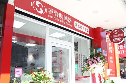
睿聲助聽器淡水門市11月9日正式開始為淡水城鎮的鄉親服務!快來門市打卡湊熱鬧,還能收到神秘禮物喔!
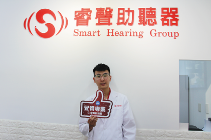
「Hearing is Our Concern」我們關懷您的聽力是睿聲助聽器的起點。我們致力成為助聽器產品和解決顧客聽力問題的領導者,透過全台灣門市提供客戶在地化的服務。門市皆採用精密的檢測設備,由專業聽力師及選配人員提供一對一服務。代理歐美多品牌知名助聽器,從入門到高階,產品款式完整。讓客戶在睿聲助聽器可以買得放心,聽得安心。
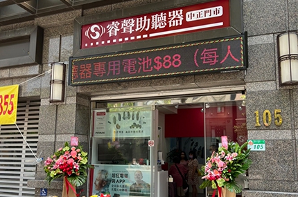
9月9日睿聲助聽器中正門市開幕活動圓滿落幕快來門市打卡湊熱鬧!還能收到神秘禮物喔!打卡送精美小禮https://lihi1.cc/ieA7m鄉親們有任何聽力問題,我們有提供:免費聽力測試助聽器選配政府補助諮詢聽力教學調頻輔具各式聽覺生活輔具助聽器維修與保養竭誠歡迎您的光臨睿聲助聽器秉持著我們的服務熱忱,在地服務。大家還有想在哪裡看到睿聲助聽器歡迎在臉書或LINE留言告訴我們唷!睿聲助聽器-中正門市地址:台北市羅斯福路一段105號1樓電話:(02)2341-5968#睿聲 #助聽器 #中正 #聽力諮詢找睿聲免費預約專線:0800-580-590線上預約:https://lin.ee/6gSIZI8全國門市:https://pse.is/LLGPA